TWO SHADES OF GREEN - TRANSFORMING MY UPSTAIRS
Mahi and my ‘Green Room’ for yoga, work and play
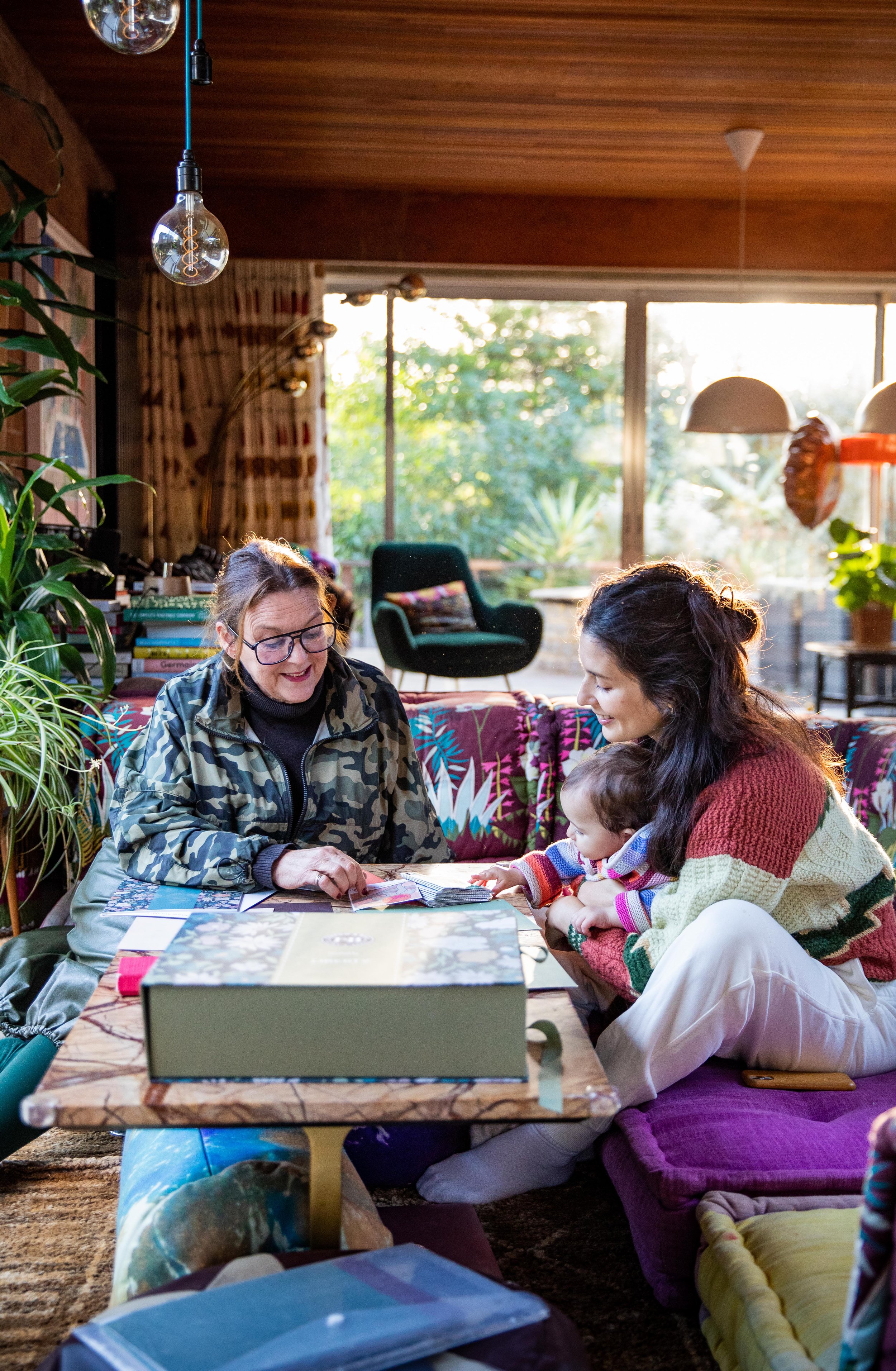
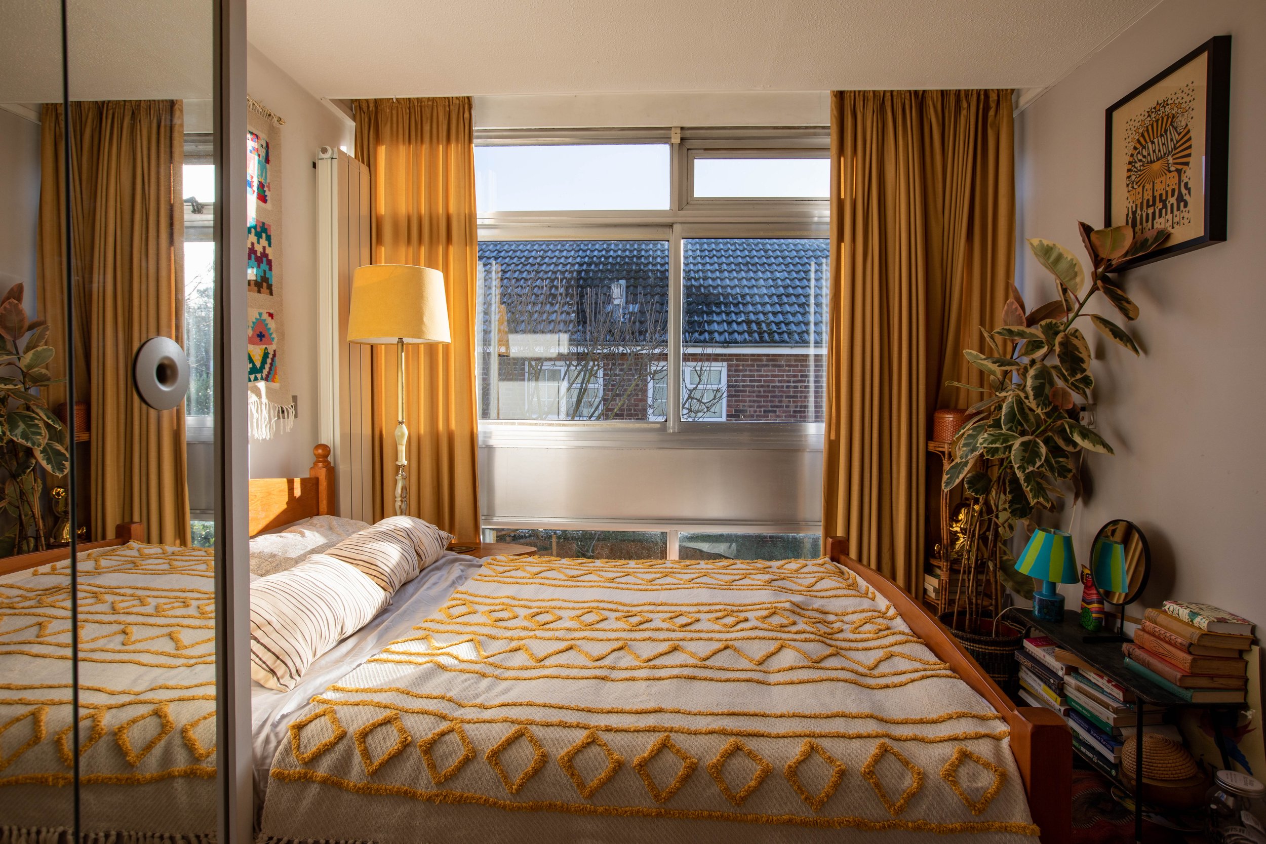
Since moving to our 1970s home in 2018, we’ve slowly been fixing and tweaking the existing spaces to make them our own. When I was pregnant with Mahi, we decorated our bedroom with the whole family in mind, looking ahead to the fact that with a newborn we’d be spending a lot of time in there. This, with our little co-sleeping roommate, turned out to be an accurate prediction. The transformation, taking the white bedroom with a khaki accent wall, as the previous inhabitants had it, to a halo of Farrow & Ball’s Dutch Orange from skirting to ceiling was such a joy that I couldn’t wait to play with more colour. While our downstairs is certainly colourful thanks to rainbow soft furnishings, the walls are either brickwork or glass windows so paint is pretty much out of the question — apart from in the downstairs loo!
Working again with Farrow & Ball, famous for their colour range, finish and low VOC, we looked at two rooms: a spare bedroom which I wanted to change into a playroom and workspace for Mahi and me, and our guest bedroom.
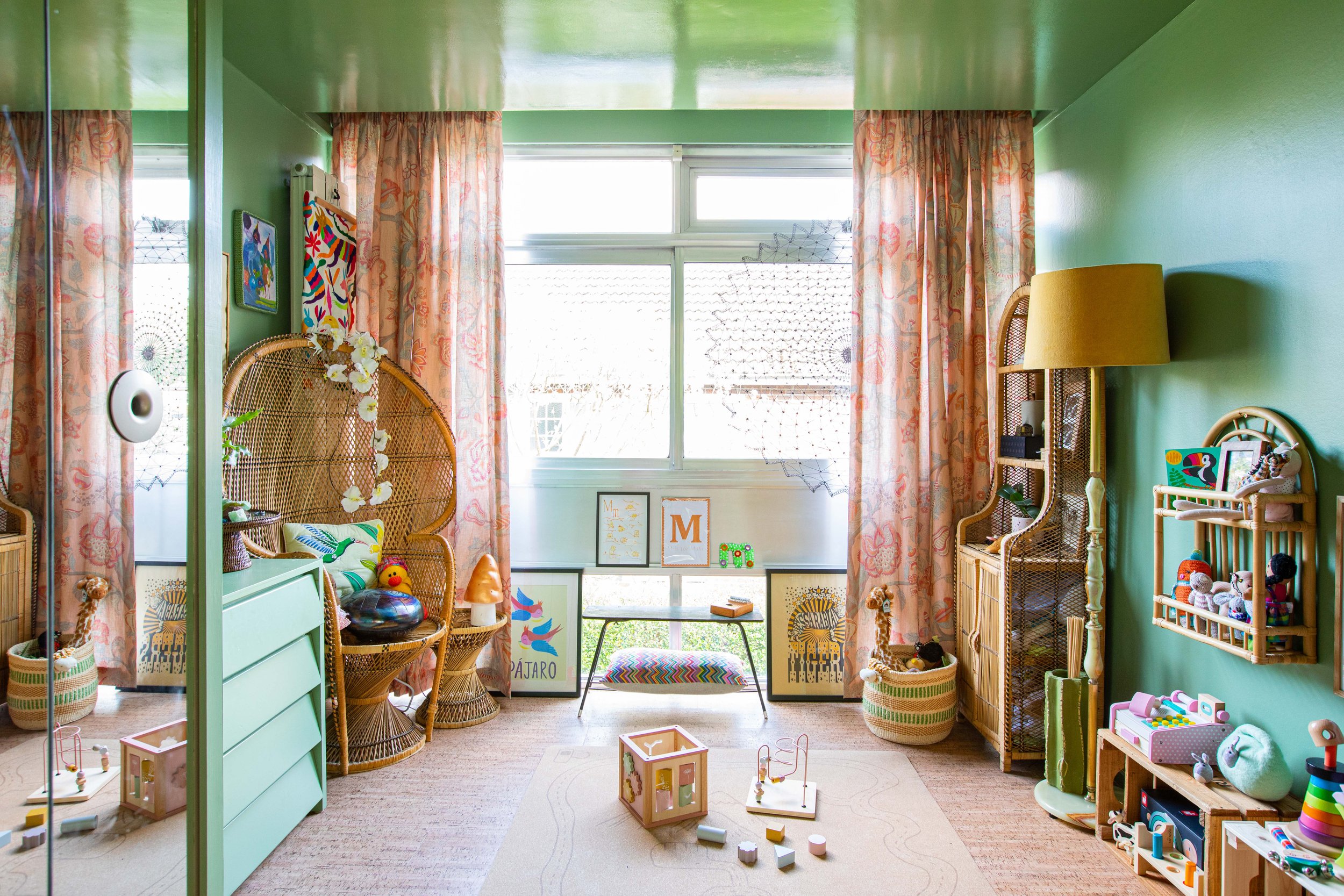
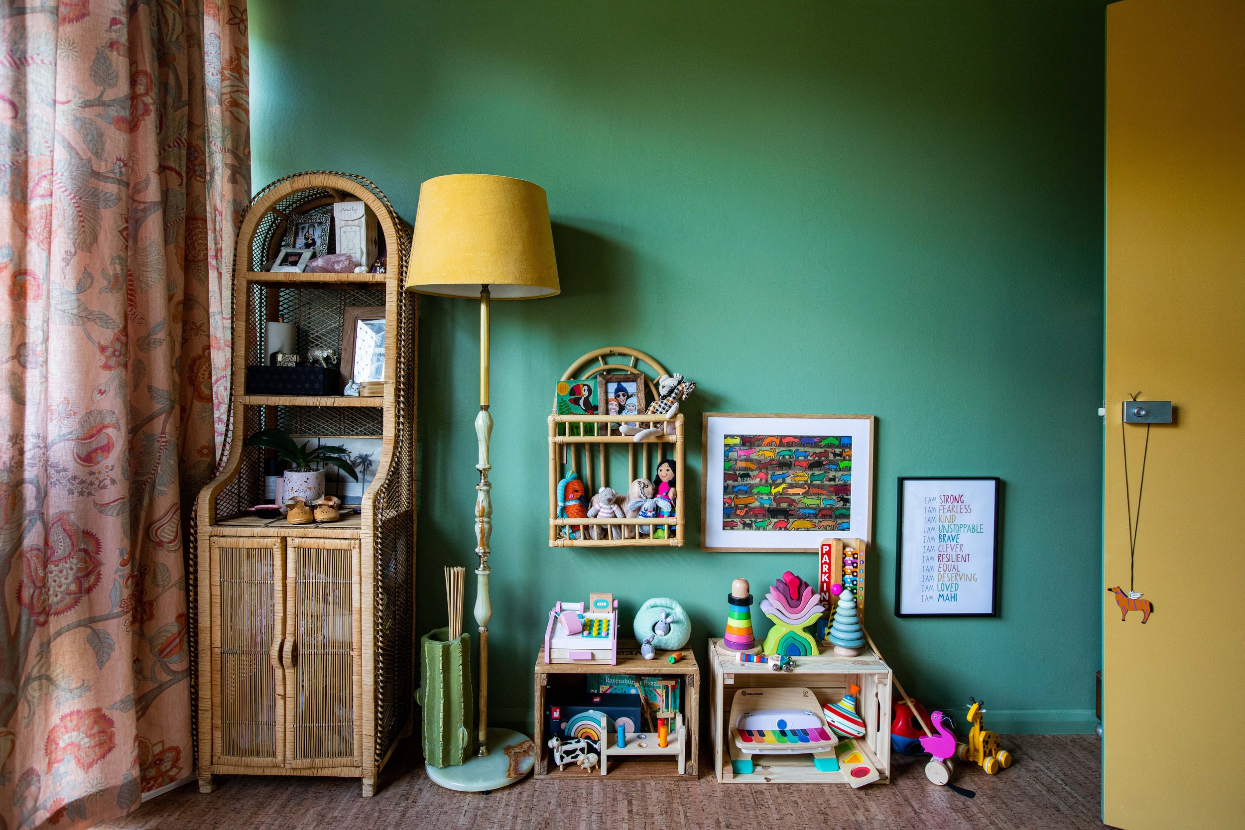
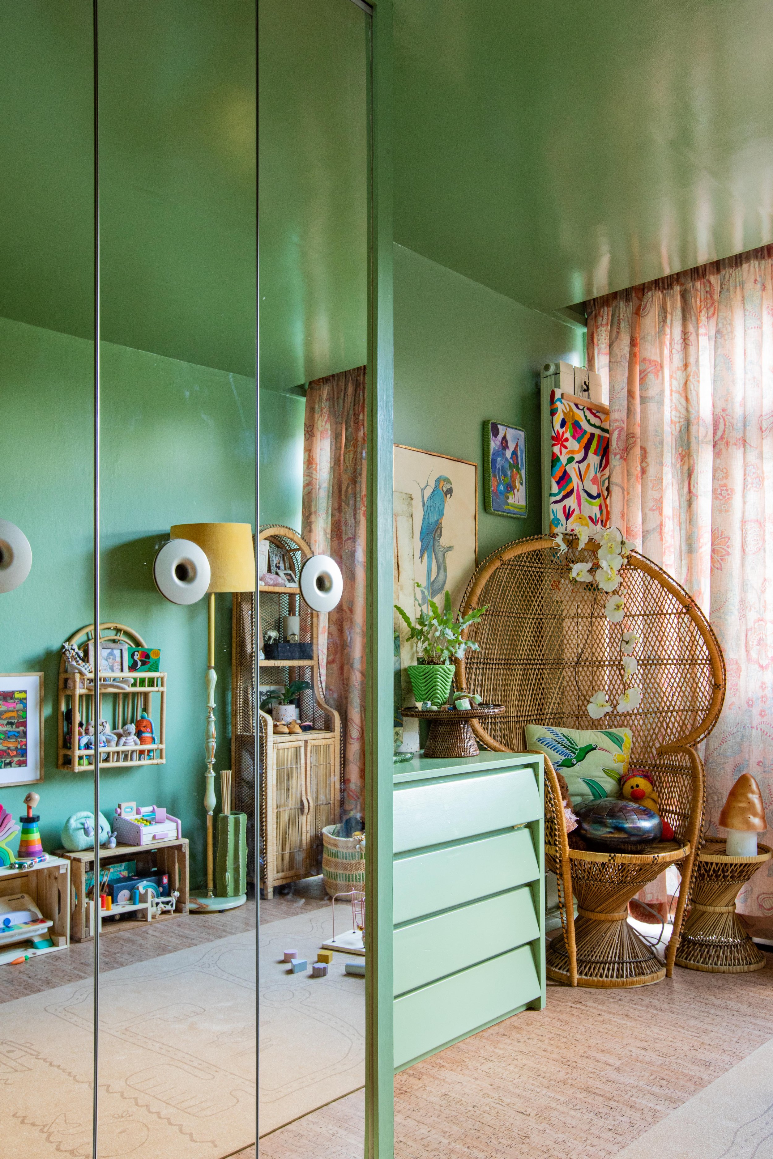
The idea for the first room, now aptly known as “the green room”(even though the other room is also green more on that below!), to create a small, cosy space which Mahi and I could spend time in during the day, and which could be a tempting space to fit in some yoga at night. Our open plan downstairs is the dream for entertaining, but not so much when you’re trying to contain a toddler and simultaneously concentrate on work! We wanted the green room room to house Mahi’s toys and clothes, some sound instruments she and I can both use (i.e. steel drums and thumb drums, rather than my delicate crystal singing bowls!), and a small bench for a laptop table that I could use while sitting on the floor with her. We already had a light, bright space to work with, but it was looking tired with a moth-eaten carpet, water stains on the floors surrounding the floor to ceiling windows, as well as on the woodwork and walls, and while our too-short, golden charity shop curtains gave a lovely glow, we wanted to go with something bolder. My initial inspiration came via a feng shui bagua chart which suggested green for this eastern area of the home, and the idea was to create something that would one day become Mahi’s bedroom — green being a very calming colour. If you’re unfamiliar with the bagua, it’s commonly described as the “energy map” in feng shui, and literally means “eight areas.” Each of these areas correspond to an area of life, and has associated elements and colours. So according to the bagua, green corresponds to the area of family and new beginnings, comparably in Vastu Shastra the Ancient Indian philosophy of design green is the colour of life, health and harmony and both philosophies place it in the eastern part of the house which is where this room is situated —all in all perfect for our work/play space and Mahi’s future big-girl bedroom!
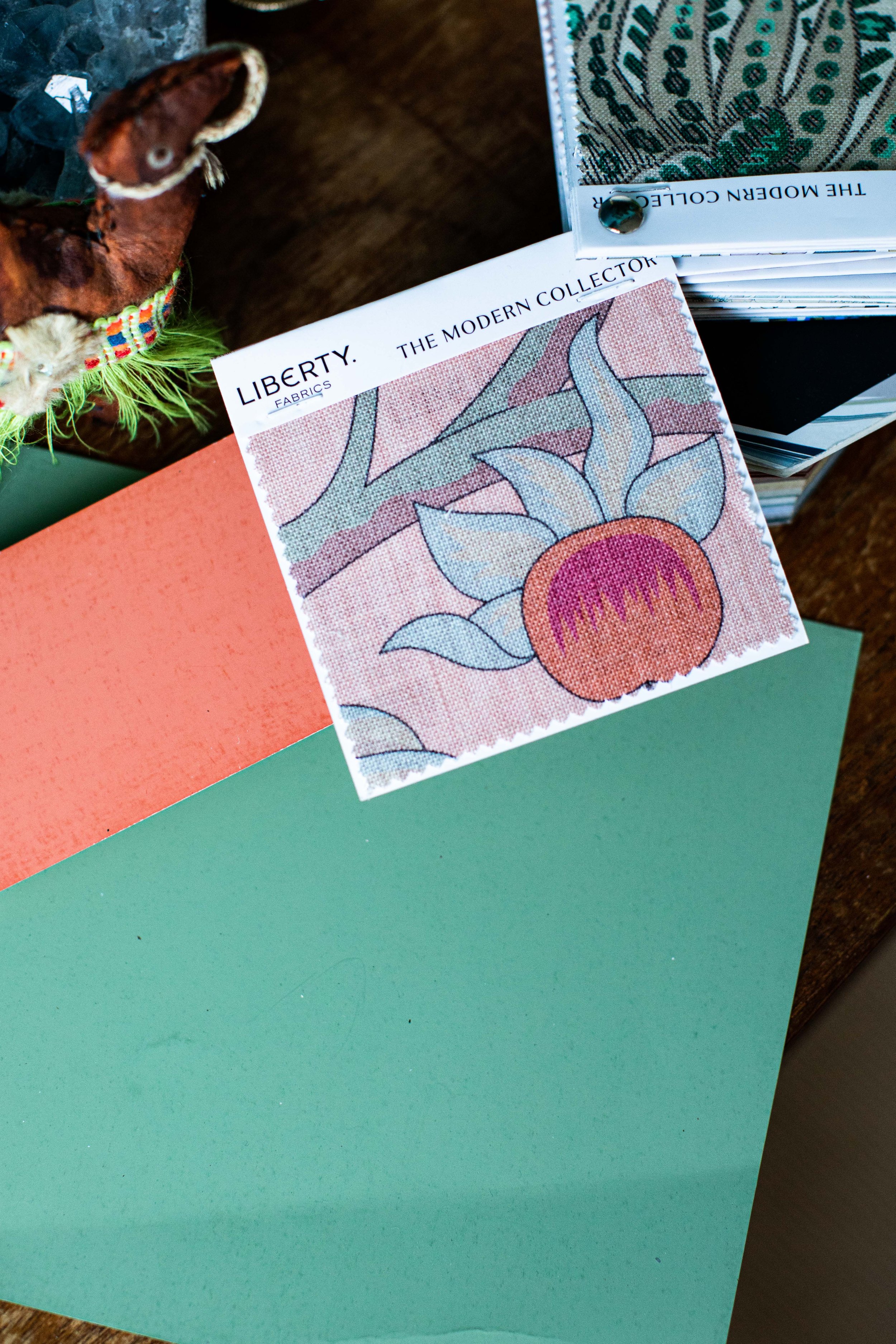
Joa Studholme, a Colour Curator at Farrow & Ball who is behind some of the brand’s most-loved shades, did our first colour consultation for the bedroom, and came back to work on this new project (as well as quickly admire her original work first hand rather than in pics!) Joa really enjoyed working with the parameters of feng shui and the ‘70s vibe of our home that she’d come to know, as well as leaning into the brand’s collaboration with Liberty. This consists of an edit of archive Farrow & Ball paint colours curated to match some of Liberty’s most iconic floral prints.
Before and afters of the ‘Green Room’
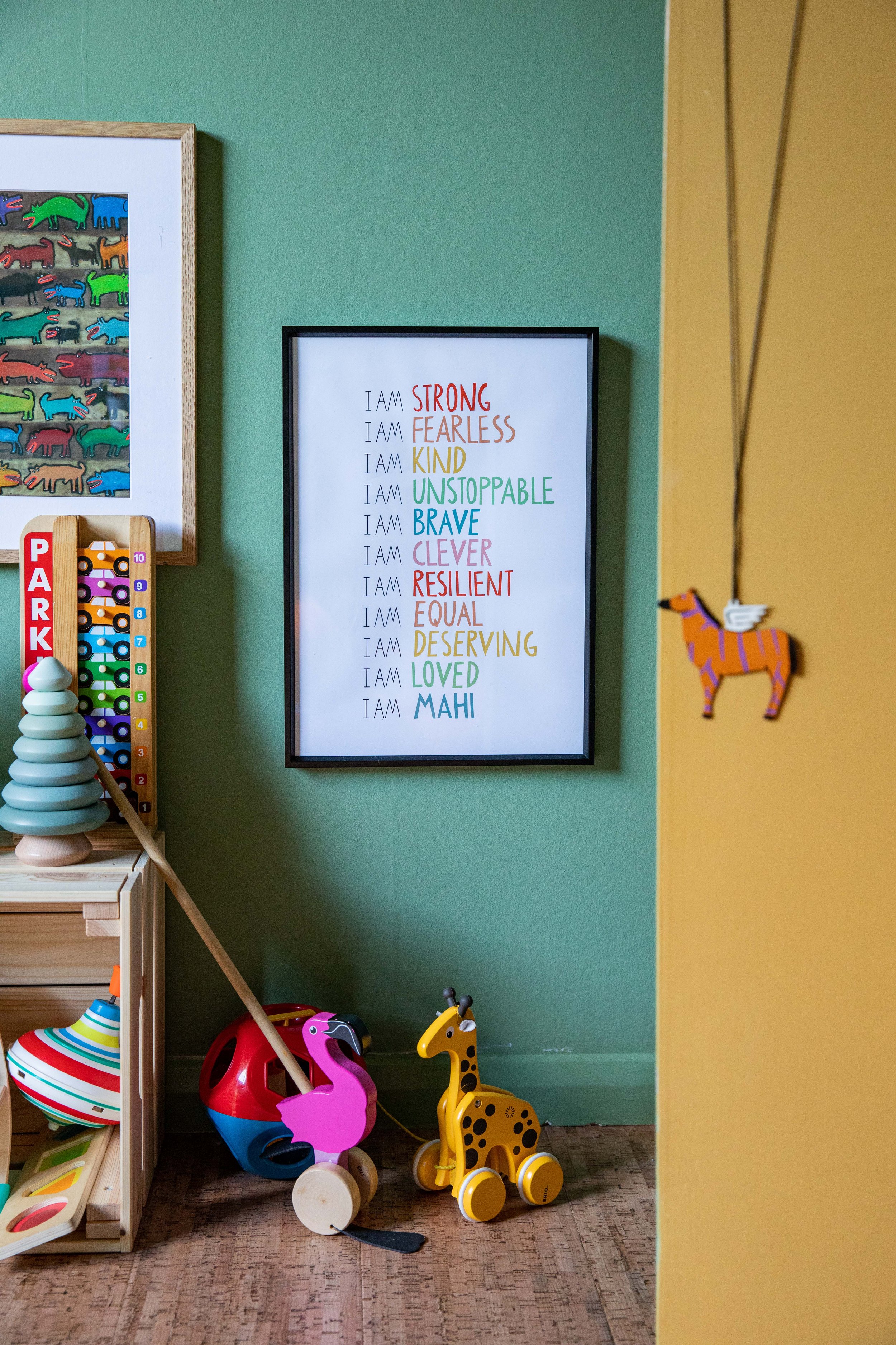
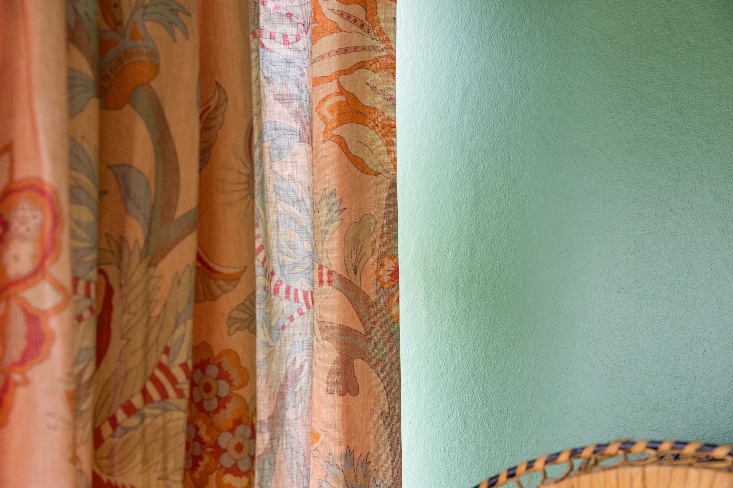
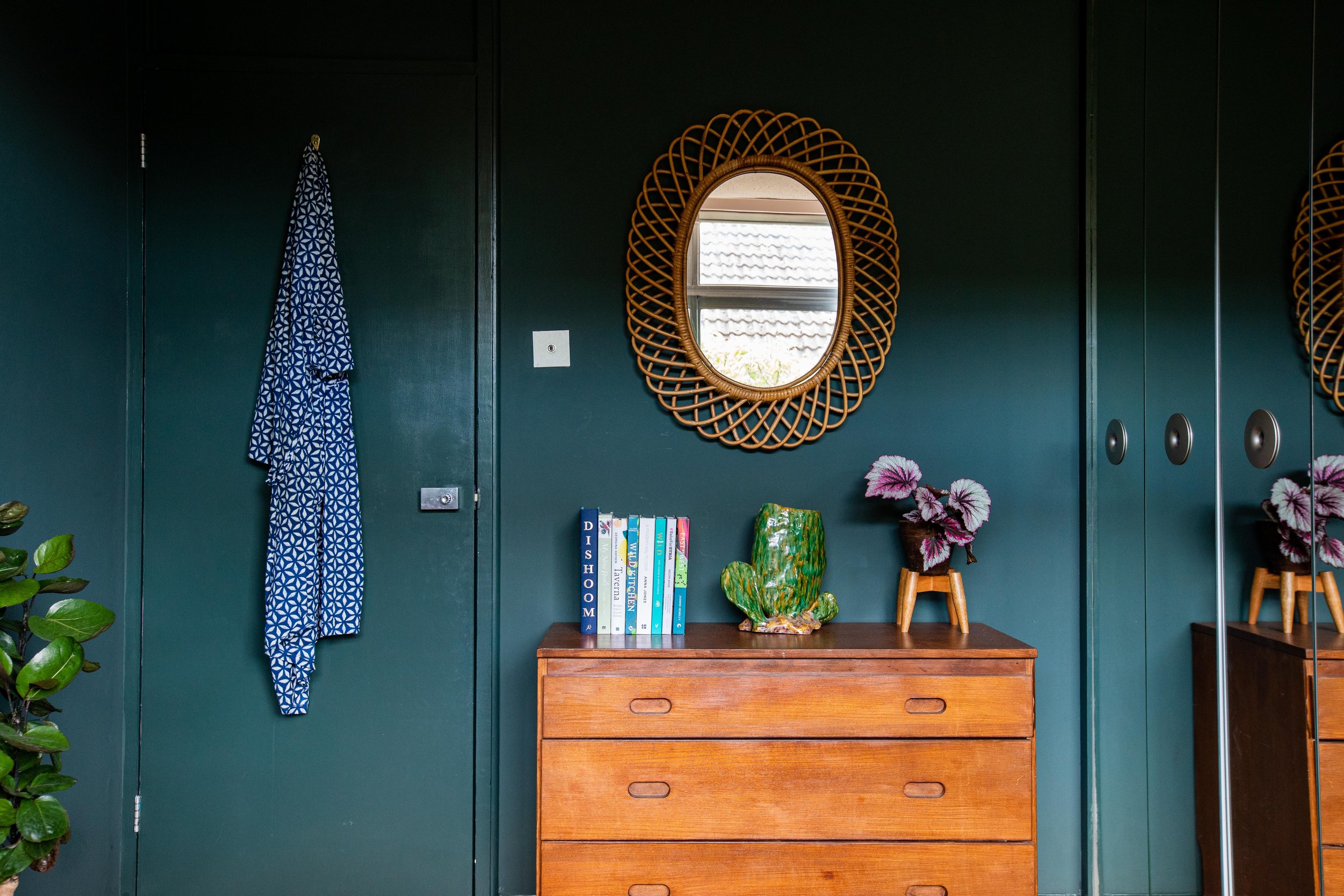
Joa suggested Suffield Green for the entire room including the door, and always one to surprise me, went for the same shade of paint but in gloss on the ceiling, with strict instructions to skim the very ‘80s artex to make it smooth. The walls were painted Modern Emulsion, the one with a slight sheen so we can easily wipe away marks from sticky fingers and yoga toes. We used Liberty print linen fabric for the curtains — Palampore in Lacquer — bringing in peach, lobster pink and grey green tones to the room. We used the Suffield Green in Modern Eggshell to paint a grey chest of drawers salvaged from a design office in Vauxhall arches during my time as a scenic artist, which had been sitting in our garage storing pots and pans from my catering days with Hemsley + Hemsley. Painting the drawers in the same shade helped to make it cohesive with the room as well as blend it into the walls, as the rooms — though you can’t tell from the photos — are quite boxy and small and we were going to be fitting a lot in! We used furniture we already had in the rest of the room, including a peacock chair from the downstairs hall, an arched wicker shelving unit bought from a vintage fair for our bedroom, to store muslin cloths and a tonne of newborn paraphernalia (that I didn't need!) and a similar arched rattan wall hung unit from OYOY. A couple of wooden crates served as floor shelving so that we could display Mahi’s toys within her reach and keep the space flexible too.
Before and afters of the Guest Bedroom
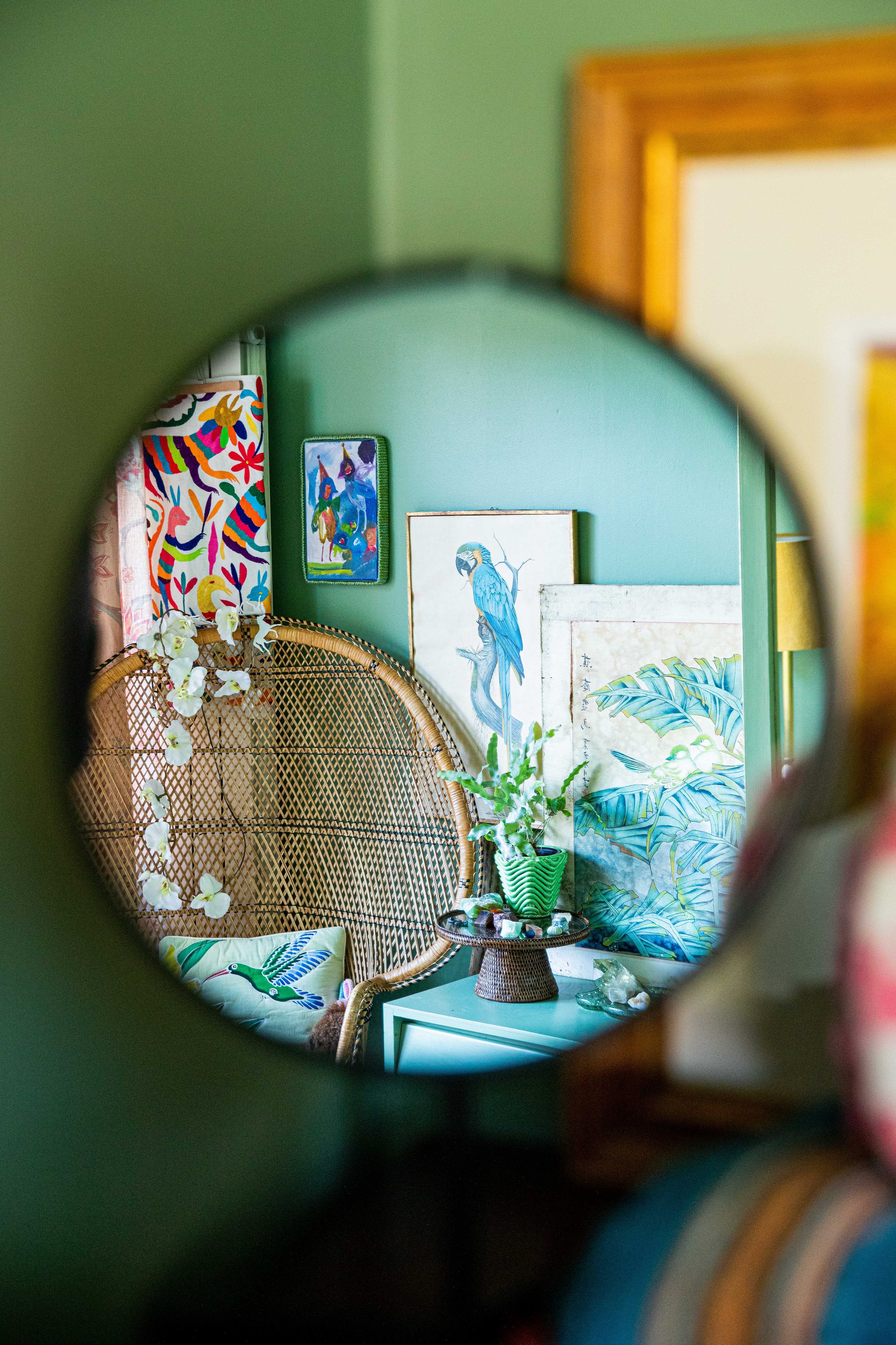
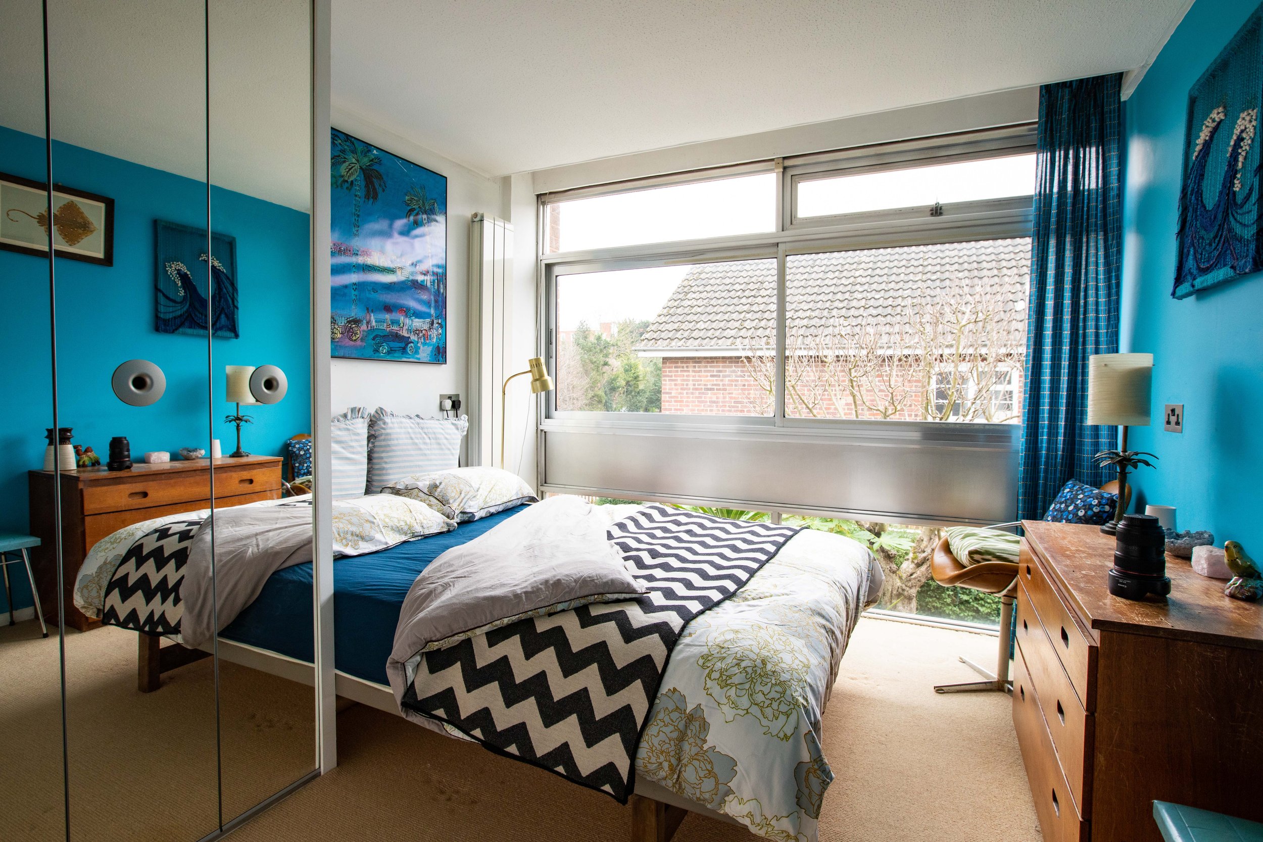
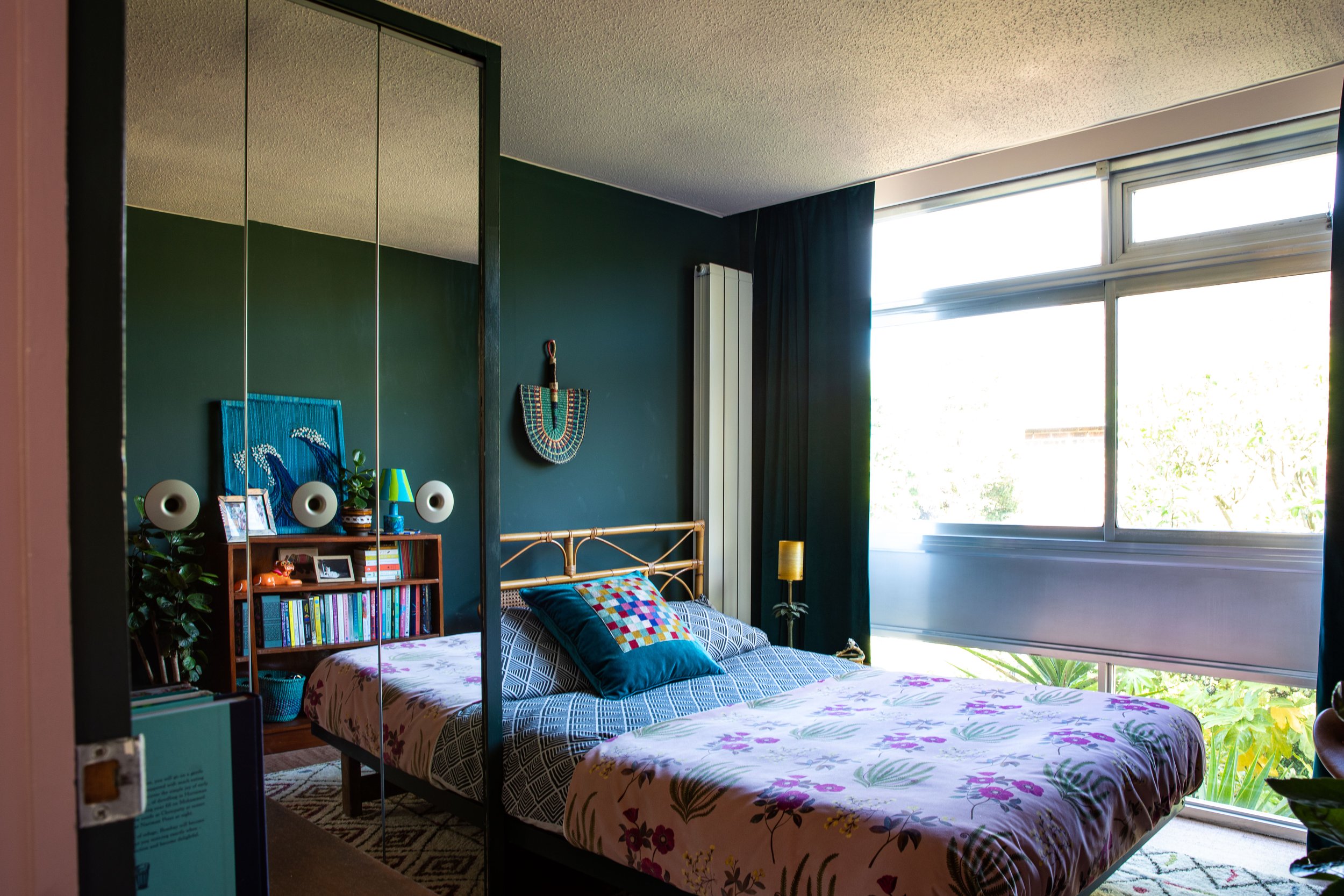
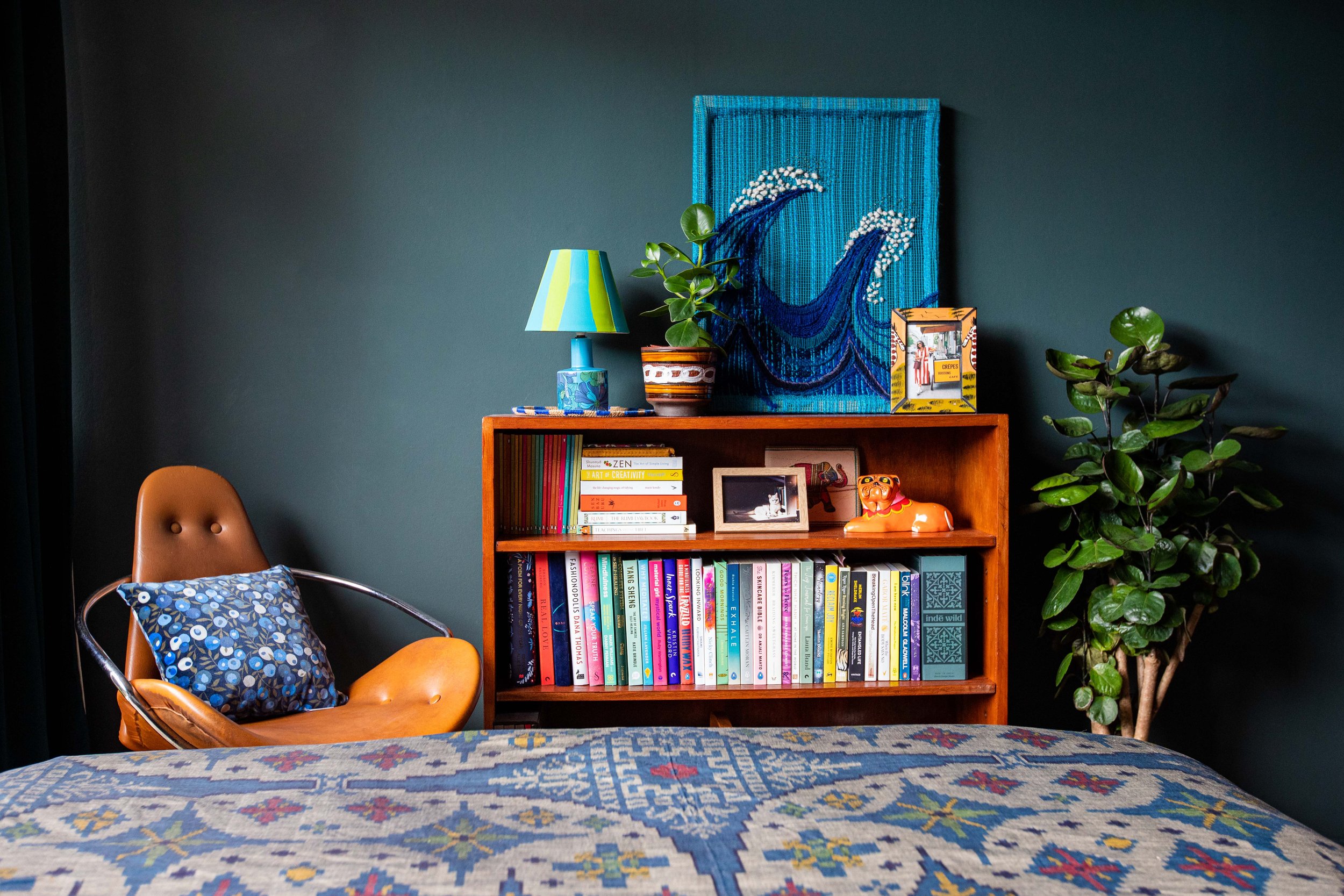
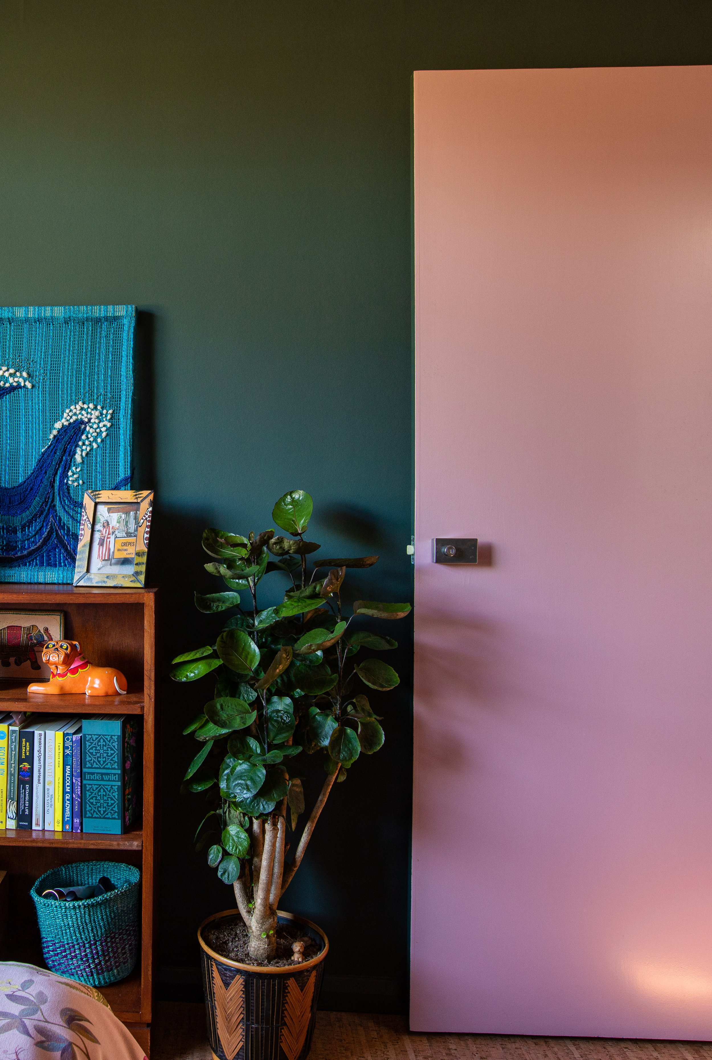
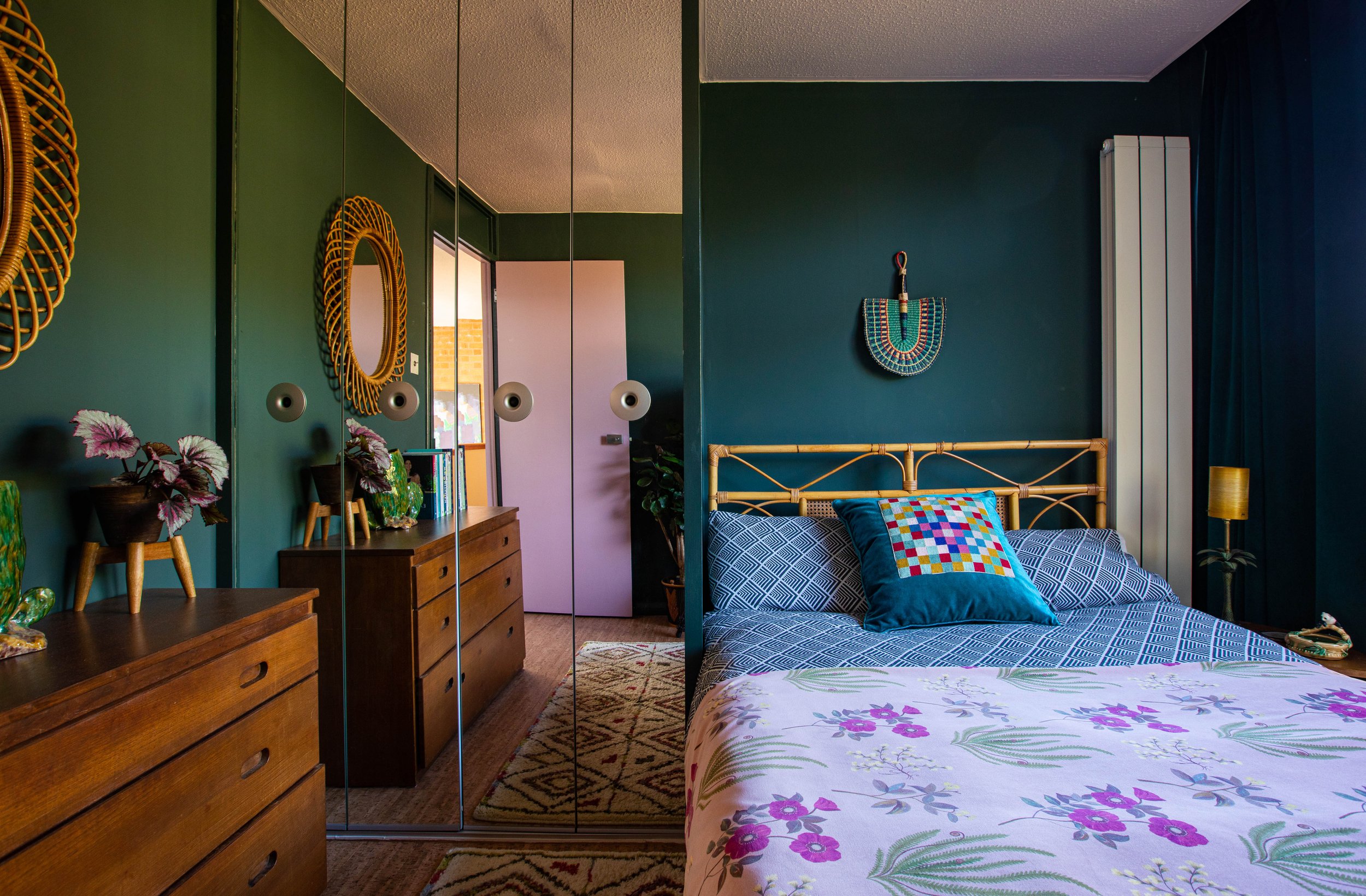
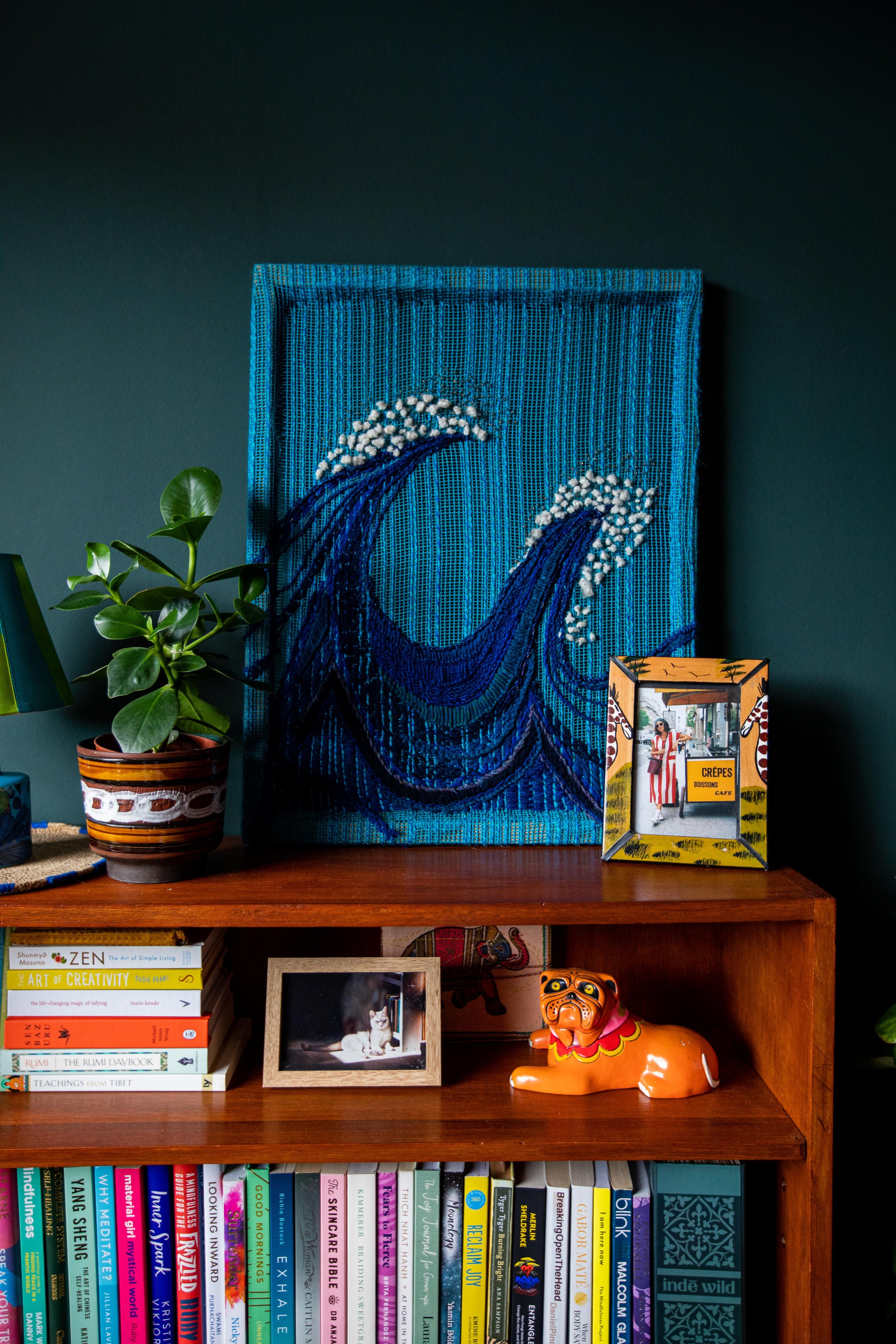
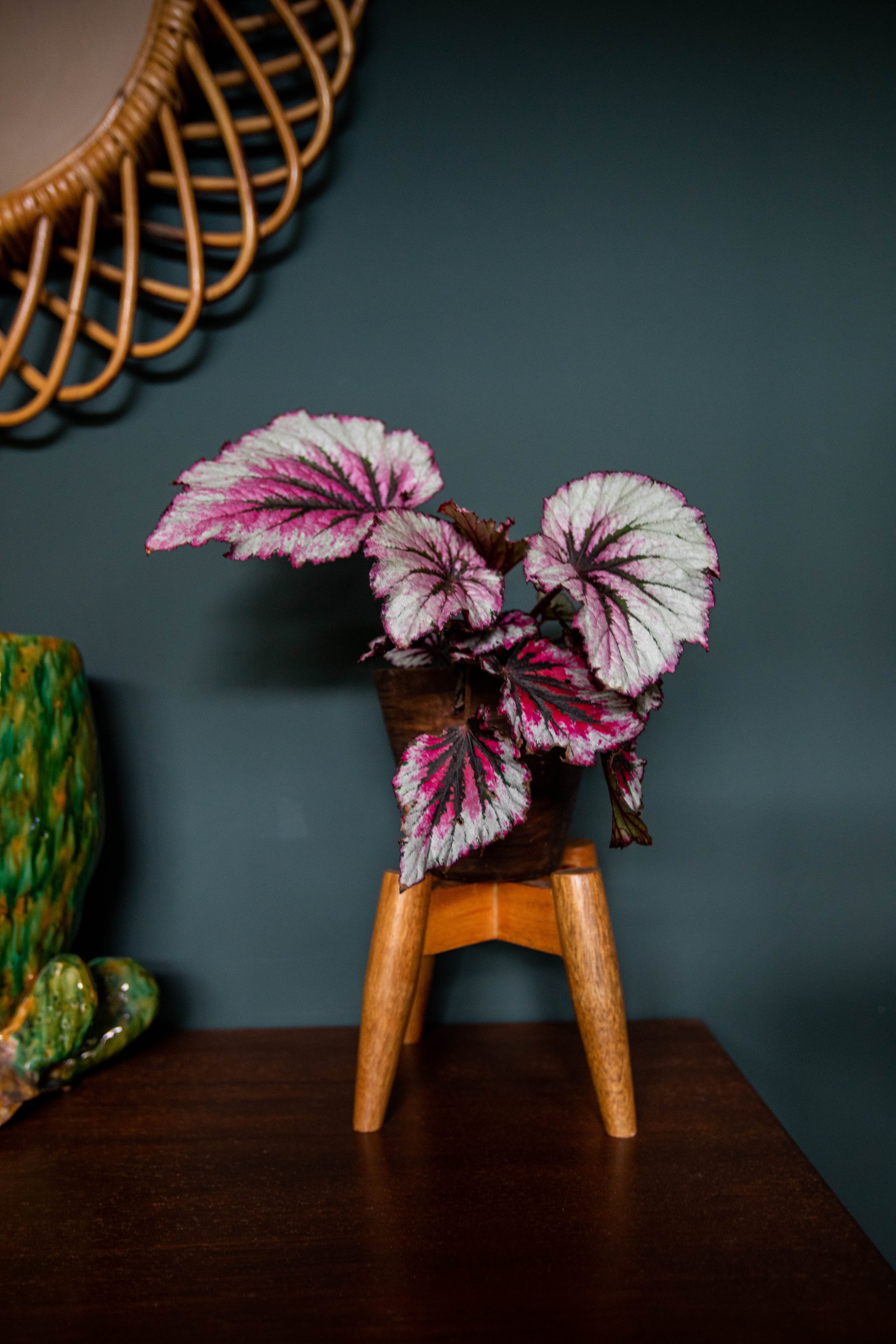
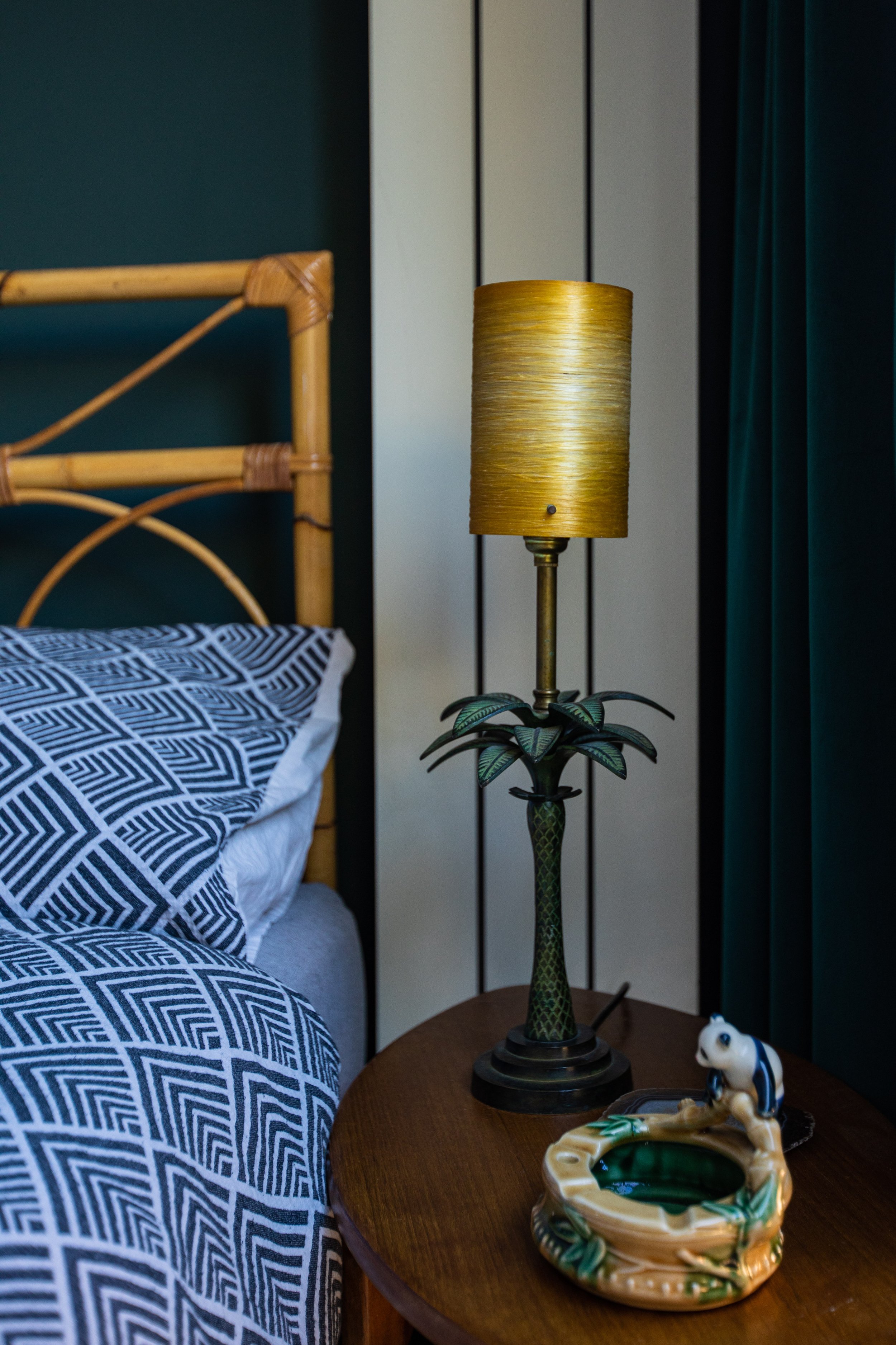
For the guest bedroom which is mostly used by my mum, we wanted to go for something more grown-up and more masculine with a hotel vibe. The room was already a bright blue — not something I might have dared choose personally but a shade that I’ve grown to love and enjoyed working with whilst we’ve had it (it also features in the bathroom next door so I didn’t have to part with it entirely!). I wanted to keep my existing blue and green toned pictures, cushions and throws collected over the years — one of the cushions, a teal velvet featuring a chequered tapestry of colours being from my gran — so from the Liberty Farrow & Ball collaboration we went with Chine Green (yes green again!), a more inky blue-y green with a lot of grey in it, which changes with light during the day. This shade worked with the feng shui recommendation of green-blue, black, brown, to represent the earth element and knowledge (very apt for a grandparent!). The result was a deep backdrop which allows accent colours such as mustard, rust, pink, and of course my dots of blue-green and any teal to pop. We moved the rug that used to be in our main bedroom which has the accent colours where it looked very at home, and found an unusual angular cane headboard for the existing platform bed (which we also gave a lick of the Chine Green eggshell used for the skirting and wardrobe). We teamed the decor with a teal shade of cotton velvet curtains, which blends with the powdery matte finish of Farrow & Ball’s signature estate emulsion walls in the morning light and then pops and shimmers again as the sun sets. Unlike the master bedroom and the green play/work room we went with a contrasting ceiling - but not so fast, rather than a classic white ceiling Joa recommended Pink Ground - the palest pink with yellow tones that was a softer match to the wall. It also kept the room cosy and rich while highlighting the pink of the outer side of the door (more on that below) which is a big feature in the room when the door is open. It also worked beautifully to allow us to change up the feel of the space more easily - working with a rich pink velvet Farrow and Ball x Liberty throw featuring the Botanical Flora Wellington print - a vintage painting style print as well as the blue, green and black throws collected on my travels (those bagua colours again!). Stepping back now I realised that I’ve chosen shades of green for both sets of rooms and paired them with peach and pink - yet they couldn't look more different!
More pictures of the Guest Bedroom
During the project we decided that the hallway with its grubby white walls and the landing doors could also do with a lick of paint. Originally we thought a grown-up Cola on the doors — a black brown shade — to smarten and unify everything rather than the different colours that had been used by the previous owners. Just before making that commitment, we realised that we would lose an element of fun, so a couple of emails and videos of the space plus a selection of colours that I thought would work winged their way over to Joa, who said, “give me the night.” Twenty minutes later, she came back with three paint colours for the doors — Cinder Rose for the Chine Green room, Stone Blue against the Dutch Orange and India Yellow to compliment the Suffield Green — that individually worked well with the hallway’s new Jitney-coloured walls, as well as working as a collection when the doors are shut, and also looked fantastic against the newly painted walls when each door opened to a colourful room. Look out for pics of this on social media! Some newly laid cork flooring flowed through the entire upstairs (bye bye, moth eaten carpet!) added to the ‘70s throwback vibe, interrupted only by the wooden thresholds beneath each door painted in the colours of the hallway door side.
Safe to say we love our newly decorated rooms and hall — if you follow me on Instagram stories you know we opened a can of worms trying to get the floors flat, and had to do some unplanned building work, then found ourselves very indecisive on what exactly we were going to put down — with a baby, a love of oils, a problem with moths and the environment to take into consideration, but I shall do a blog post on that too once I’ve digested it for a bit!
*This blog post was created in partnership with Farrow & Ball.


